When Sarah moved into her new apartment, she found it overwhelming to choose wall colors. With so many options available, she felt unsure of where to begin. However, one evening at a home decor store, everything changed. Sarah observed how specific colors evoked different emotions within her. Cool blues brought a sense of calm, while vibrant reds energized her. This encounter ignited Sarah’s curiosity in the psychology of color.
It’s not just about looks; it’s about how colors make us feel. She realized the importance of colors in interior design. With this new understanding, Sarah wanted to pick the perfect colors for her home. She aimed to blend her style with the psychological impacts of her choices. Now, she was ready to turn her apartment into a personalized sanctuary.
Key Takeaways
- The psychology of color plays a significant role in interior design.
- Understanding color associations helps create the desired ambiance in homes.
- Different colors evoke specific emotions, guiding effective color palette selection.
- Timeless and trendy colors each have their place in creating a balanced home environment.
- The right color choices can enhance mood and promote well-being in various spaces.
Understanding Color Theory in Interior Design
Color theory is key for picking the right shades in decorating. It helps us understand how colors work together. This knowledge lets people create spaces that feel just right. The basics of color theory cover primary, secondary, and combinations for perfect harmony.
What is Color Theory?
Color theory starts with three main colors: red, yellow, and blue. Mixing these makes secondary colors like green, orange, and purple. Adding primary to secondary colors gives us even more options. This organized method guides designers in selecting colors. It’s a map for making spaces look and feel united.
Importance of Color Relationships
Knowing how colors relate is crucial for designing engaging interiors. Different color schemes, like complementary or analogous, create unique looks. Complementary colors offer a bold contrast, perfect for lively areas. Analogous colors, however, make a place feel calm and together. These principles help in balancing a room’s feel, impacting mood and comfort.
| Color Type | Examples | Effect on Mood |
|---|---|---|
| Primary Colors | Red, Yellow, Blue | Foundational, Vibrant |
| Secondary Colors | Green, Orange, Purple | Dynamic, Eye-Catching |
| Tertiary Colors | Red-Orange, Yellow-Green | Complex, Diverse |
| Warm Colors | Reds, Oranges, Yellows | Cozy, Inviting |
| Cool Colors | Greens, Blues, Purples | Calming, Refreshing |
Color theory is crucial in designing inviting homes. It guides us in making choices that bring together colors beautifully. This ensures our spaces are welcoming and balanced.
interior paint color palette
As an affiliate, we earn on qualifying purchases.
As an affiliate, we earn on qualifying purchases.
The Emotional Impact of Colors
Colors in interior design are powerful. They shape how we feel in our homes. By understanding color psychology, homeowners can create the atmosphere they desire. This comes from knowing how certain colors affect our mood.
How Colors Influence Mood
Colors touch our emotions differently. For example, red sparks energy and excitement. It makes your heart beat faster. Orange and yellow, on the other hand, make us feel more lively. Orange boosts our appetite and energy. Yellow lifts our spirits and helps us communicate better.
Pastel colors, like pink, calm us down and lessen aggression. Green brings a peaceful feeling, slowing down our heart rate. Then there’s blue. Blue makes us feel calm, lowers our blood pressure, and helps us sleep better. It’s perfect for a bedroom.
Purple increases our sensory awareness. Brown can make us feel relaxed. However, gray might make some people feel gloomy, and too much white might be overwhelming. Darker colors like black can make us look inward but sometimes feel a bit low. These effects show how important color choices are for our home’s emotional tone.
Common Color Associations
This table shows different colors and their emotional impacts:
| Color | Emotional Impact |
|---|---|
| Red | Energy and excitement; increases heart rate. |
| Orange | Boosts appetite and energy. |
| Yellow | Enhances communication and memory. |
| Pink | Promotes calmness and reduces aggression. |
| Green | Encourages tranquility and energy preservation. |
| Blue | Induces relaxation and lowers blood pressure. |
| Purple | Enhances sensory awareness. |
| Brown | Creates a sense of relaxation. |
| Gray | Dampens mood and energy. |
| White | Bright and focused but can feel uncomfortable. |
| Black | Introspection but may lead to depressed moods. |

color psychology wall art
As an affiliate, we earn on qualifying purchases.
As an affiliate, we earn on qualifying purchases.
Exploring the Psychology of Color: Choosing the Right Palette for Your Home
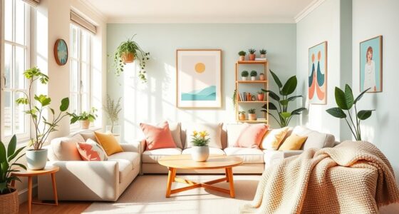
When you pick colors for your home, it’s not just about looks. It’s also about how colors make us feel. For example, blue brings calm and is great for bedrooms and bathrooms. It helps us relax. Green brings peace and health, perfect for living rooms or home offices.
Yellow means happiness and works well in kitchens or dining areas, where people hang out together. Red adds energy and is good for dining spots, making them lively. Purple stands for luxury and sparks creativity, suited for living areas or offices. And orange is all about fun, awesome for gyms or playrooms.
Neutrals are flexible, adding elegance without taking over. A good room mixes colors well: complementary colors for excitement, similar ones for harmony, and triadic schemes for balance. What you choose should show off your style and how you live.
Knowing how color affects mood is key to making rooms that feel good. A main color brings everything together. Trying out paint samples helps pick the best colors that match your taste and the room’s vibe.

| Color | Associated Emotion | Ideal Rooms |
|---|---|---|
| Blue | Calmness | Bedrooms, Bathrooms |
| Green | Tranquility | Living Rooms, Studies |
| Yellow | Happiness | Kitchens, Dining Rooms |
| Red | Passion | Dining Areas, Accent Colors |
| Purple | Luxury | Living Spaces, Offices |
| Orange | Energy | Exercise Rooms, Play Areas |
| Neutral Tones | Flexibility | Any Room |
calming blue bedroom paint
As an affiliate, we earn on qualifying purchases.
As an affiliate, we earn on qualifying purchases.
The Role of Colors in Different Rooms
Colors play a crucial role in setting a room’s mood. Each room has a unique purpose, and the right colors can enhance that. Knowing how to pick colors for bedrooms, kitchens, and living rooms helps create the right environment for activities and feelings.
Bedrooms: Creating Calm Spaces
Bedrooms are places for rest and peace. Soft blues, greens, and gentle purples work well here. These colors bring tranquility, perfect for peaceful sleep and relaxation. Also, choosing colors that you personally like can make the space more comforting.
Kitchens: Energizing Ambiance
The kitchen is where the heart of a home beats, full of life and gatherings. Bright, warm colors like yellows, oranges, and reds bring energy and encourage people to socialize. These shades make the mood better and the space welcoming. Following the 60-30-10 rule—a dominant warm color, a complementary secondary color, and an accent—makes the kitchen both lively and harmonious.
Living Rooms: Balancing Relaxation and Socialization
Living rooms are for chilling and hanging out with others. Using a mix of colors helps balance these activities. Combining soft neutrals with bold colors makes the room versatile. Warm shades mixed with calming ones offer a cozy spot for chats while also keeping a relaxed vibe.

| Room | Color Type | Function |
|---|---|---|
| Bedrooms | Cool Colors | Create calm, restful spaces |
| Kitchens | Warm Colors | Enhance energy and social interaction |
| Living Rooms | Blended Colors | Balance relaxation and engagement |
vibrant red accent wall paint
As an affiliate, we earn on qualifying purchases.
As an affiliate, we earn on qualifying purchases.
The Color Wheel: A Guide to Harmonious Choices
The color wheel helps pick colors that work well together. It shows how colors interact, helping you create a beautiful space. It lets you make a palette that brings your room to life.
Monochromatic Schemes
Monochromatic schemes use one color in different shades and tints. They make a space feel calm and put together. Using variations of the same color, you can design a space that’s striking yet harmonious. These schemes are perfect for bedrooms or places for quiet time.
Complementary and Analogous Colors
Complementary colors are opposite each other on the wheel, like blue and orange. They add excitement and contrast to a space. These pairings are great for lively areas like living rooms. On the other hand, analogous colors are side by side, like blue and green. They bring a peaceful vibe, ideal for rooms meant for rest.

The Influence of Lighting on Color Perception
Lighting shapes how we see colors in a space. It’s vital to know the difference between natural and artificial light. This knowledge helps create the right mood in any room. The kind of light used can change how colors look. This affects the room’s overall look and feel.
Natural vs. Artificial Light
Natural light makes colors look brighter and more true to life. This makes rooms feel more welcoming. It’s great for living rooms or dining areas where warm colors like reds and yellows shine. These colors bring energy and warmth. Artificial light, though, can change how we see colors. Incandescent, fluorescent, or LED lights each have different effects on colors. So, choosing the right light is key for accurate color representation.
Testing Colors in Different Lighting Conditions
It’s important to test colors in various lighting to keep their charm all day. Look at colors under natural and artificial lights to find out more. For example, cool blues and greens might pop under warm evening lights. But they may look dull in daylight. Light pastels can create a calm atmosphere in natural light.
Deeper shades offer a touch of sophistication. Yet, they might be too bold in strong artificial light. Mixing warm and cool colors right can make a room perfect for rest, creativity, or work.

Balancing Bold and Neutral Colors
Creating a pleasing space means mixing bold and neutral colors well. Bold colors add life to a room without taking over. For example, a bright red or a sunny yellow can make fun highlights. These are set against neutral backgrounds. This approach makes the area look exciting but still welcoming.
Using Bold Colors as Accents
Bold colors can set the mood and inspire activities. For example:
- Red makes a place lively, great for living rooms or gyms.
- Yellow brings warmth and hunger, best for kitchens but not too much.
- Orange sparks creativity and energy, ideal for offices or where people hang out.
Creating Harmony with Neutrals
Neutrals are key in calming down the bold colors. They make a peaceful scene. Good neutral colors include:
- Soft whites and grays make places look clean, like in bathrooms.
- Warm neutrals are welcoming, perfect for living and dining spaces.
- Cool neutrals and bright accents help focus and work well in offices.
By smartly mixing bold with neutral colors, designers make places that are both energetic and calm. They meet different needs but keep everything looking good together.

| Color | Effect | Ideal Spaces |
|---|---|---|
| Red | Increases heart rate and activity | Living room, home gym |
| Blue | Calming, lowers blood pressure | Bedrooms, bathrooms |
| Yellow | Boosts appetite, warmth | Kitchens, dining areas |
| Green | Symbolizes balance and harmony | Home offices, bedrooms |
| Purple | Promotes calmness or sophistication | Bedrooms, living areas |
| Orange | Inspires enthusiasm and creativity | Social spaces, home offices |
Practical Considerations When Choosing Colors
Choosing paints is not just about looks. It’s about mixing practical factors that affect your room’s feel. Knowing about paint durability and how big the room is helps create a balanced and useful space.
Durability and Maintenance of Paints
When picking paints, think about how tough they are. Some paints are better for busy areas because they last longer. For kitchens and bathrooms, semi-gloss or satin finishes are good because they resist moisture and are easy to clean. How easy it is to maintain different paints affects how often you’ll need to touch up the walls. High-gloss paints look nice but might need more care than flat finishes. Flat finishes hide dings but aren’t as easy to scrub clean.
Size and Shape of the Room
The size of the room matters a lot when choosing colors. Light colors can make small rooms feel bigger and more welcoming. Dark colors can make large rooms cozy but use them carefully to avoid a cramped feeling. The room’s size and shape influence what colors will look best.
Rooms with lots of natural light can handle bold colors. But if a room doesn’t get much light, it’s better to use light, bright colors. These can make the room feel happier and more open.

Current Trends vs. Timeless Colors
Finding the right mix of trendy and timeless colors is key in interior design. Homeowners often pick colors that are both modern and classic. Knowing how to mix these can spark creativity and keep a room’s look together.
Finding a Balance
Color trends and classic palettes shape a home’s feel. The 90s loved sage green and pink beige, while the early 2000s favored espresso brown. Since 2016, black has been big in decor, thanks to new tech and its popularity online.
Timeless colors like soft gray, beige, and white form a strong base. They’re versatile and last long, perfect for a modern yet timeless space. Adding accents carefully creates a room that can evolve with the trends.
Incorporating Trends into a Classic Palette
Adding trendy colors to a classic look means being flexible with decorations. Bold colors like deep blues or rich burgundies bring elegance without overpowering. A simple black and white background lets vibrant or earthy colors pop.
According to color psychology, blues and greens make bedrooms peaceful, while yellows and oranges brighten up home offices. Starting with a neutral base helps homeowners change decorations easily. This approach keeps decor interesting and ensures it stays attractive over time.

Personalizing Your Home with Color
Choosing colors for your home lets you make spaces that show who you are. When you pick colors you love, every room turns into a place that means something special to you. Using colors with personal importance makes each space feel true to you and welcoming.
Reflecting Personal Style and Preferences
Your own style impacts your color choices a lot. Some people love calm blues and greens for quiet rooms. Others choose lively reds and yellows for areas like kitchens. Knowing the effect of colors on feelings can guide you in choosing wisely.
Vibrant oranges are great for fun rooms, while soft pastels make reading spots cozy. Including your favorite colors makes the whole house feel more like home.
Incorporating Meaningful Colors
Adding colors that mean something to you makes your home feel closer to your heart. Different colors make us feel different things—blue is calming, green feels fresh, and gray is classy. The 60-30-10 rule helps balance colors: 60% for the main color, 30% for secondary colors, and 10% for accents.
Try your colors in different lights to see the true effect. This ensures your home matches your lifestyle perfectly.

| Color | Emotion | Best for |
|---|---|---|
| Blue | Calming, serene | Bedrooms, bathrooms |
| Red | Energy, passion | Dining rooms |
| Green | Refreshing, tranquil | Living rooms |
| Yellow | Cheerfulness, warmth | Kitchens |
| Gray | Neutral, sophisticated | Any room |
| Purple | Royal, creative | Bedrooms, luxury spaces |
| Orange | Vibrancy | Playrooms, workout areas |
Impact of Color Choices on Space Perception
Understanding how different colors change the feel of a room is key to a welcoming home. Colors do more than just look pretty; they affect our emotions too. Light and dark hues play big roles in how big or small a room feels.
Using Light Colors to Create Space
Want your room to feel bigger and brighter? Use light colors like white, cream, or soft pastels. These colors make spaces feel open and inviting. If your room gets natural light, light colors can make it feel even more spacious.
Soft blues and greens add a calm vibe, making the room seem larger. To boost this effect, add mirrors. Mirrors reflect light, making the space look bigger.
Dark Colors for Intimacy
Prefer a cozy feel? Choose dark colors. Deep blues, grays, or greens can make a space feel snug and welcoming. Sure, dark colors might make a room feel smaller, but they add depth and elegance, especially as accent walls or in furniture pieces.
Using dark tones right means balancing them with light accents. This keeps the room cozy but not too tight.

Picking the right colors can really change how a room feels. With these tips, you can make any space both comfy and stylish.
| Color Category | Effect on Space Perception | Recommended Uses |
|---|---|---|
| Light Colors | Make spaces feel larger and airier | Smaller rooms, ceilings, and sunlit areas |
| Dark Colors | Create coziness and warmth | Accent walls, living rooms, and bedrooms |
| Neutral Colors | Promote harmony and versatility | Any room; complements both light and dark tones |
| Cool Colors | Evokes feelings of tranquility | Relaxing spaces like bedrooms and bathrooms |
| Pastel Colors | Add a soft, airy quality to interiors | Children’s rooms, kitchens, and living areas |
Conclusion
Looking into color psychology, we find it plays a huge role in interior design. A careful choice of colors can shape how we feel in a room. It’s important to know how colors affect our mood and the space around us. For example, bright colors might bring energy to a kitchen, while cool shades can make a bedroom more relaxing.
By following color palette tips, we can see how different colors look at various times. Sunlight makes warm colors bright, but electric light changes how colors appear. Knowing this helps us choose the right colors for our homes. We can pick colors that fit our style and make each room work better.
In wrapping up, choosing colors wisely does more than make our homes look good. It changes how we feel in our living spaces. Using color psychology, our homes can become places of peace and comfort. They become beautiful spaces that also help us feel good.